
Overview of Design System
As the head of product design at 1TX, I had the responsibility of ensuring that our design system helped us moved faster together. When I joined, I inherited an over-built and under-documented Figma file that failed to translate into the front-end system. By the time I left, I had established documentation and a practice of critique and governance on the design side to evolve the system, and had kick-started the process on the engineering side to make the design system a shared priority between design and engineering.Impact
We immediately saw an increase in cohesion and decrease in rogue components, and a faster pace of iterative and early design work. The governance process I established created more opportunities for designers to work together, getting early visibility into how the system was emerging across the product. This visibility expanded as we hired a dedicated front engineer and started to pull the visual system into code.My Role
Head - UX ArchitectTeams
Engineering Team, UI/UX design TeamWhat is a Design System?
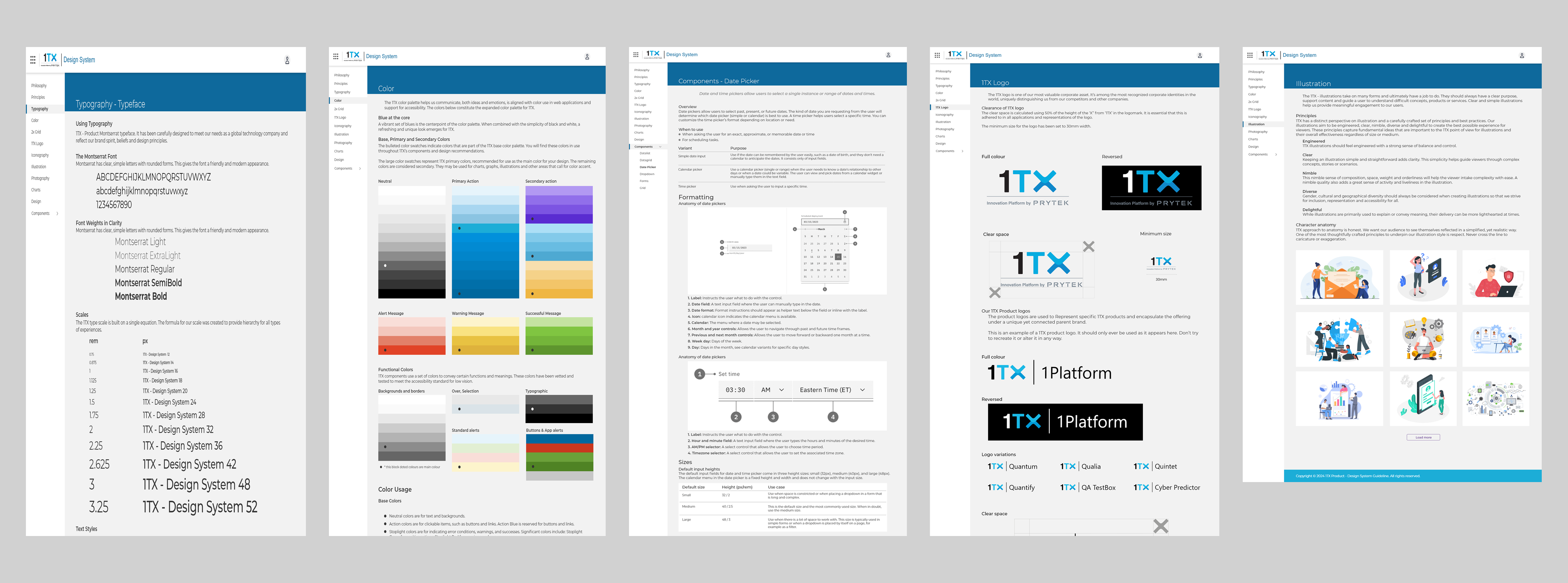
A Design System is a systematic approach to product development complete with guidelines, processes, components, and code. It is a single source of truth for teams that simplifies the product creation, testing, and development, and ensures consistency across different pages and channels.Design Process
 Processflow
Scope and considerations
Working as a Head-UX Architect, I had limited time to develop a design system along with other quick UX work. The design system had to scale rapidly as I discovered new use cases, constantly iterating and expanding the library, so I had to approach this challenge strategically.Working with UX Designers and Front-End Engineers, I established a set of short term and long term priorities. Rapid scalability and modularity were some of the guiding principles, working towards a tight deadline for the launch of the MVP. In practice this often meant favouring reusable components and a templated approach to layouts, where possible.
 Evolution of the Design System
Building on a philosophy of configurability
Although I avoided rebuilding as much as possible, I had to rearrange many of the more complex components.Currently I'm connecting my team to understand how and when we use different variations. This helped us decide which properties to group together, which elements to combine as variants, and which to nest.
I wanted my team to avoid splitting components, but I also realized that the pace of new work would lead to the identification of new variations.
To address this, I introduced slot components, which had just been starting to take after Figma's Config.
 Design System - Detaching Components
Slot components allow the designer to change the content of a component or subcomponents without impacting the set structure of the primary component itself. For example, they could maintain the property spacing and details for a card and its header and footer, while adjusting the card's purpose to the design.
Not just a set of components
While working with the design team, we ensured that user research was baked into the design system and organized several prototype usability studies and other discovery exercises. These helped in the development of component library and interaction methods.Another consideration is designing with real data in mind. Lorem Ipsum is my go-to when it comes to low-fidelity wireframing, but when finalizing components and screens, I try to insert as many real data values as possible. This reduces the risk of running into difficult "what if" roadblocks later on.
- What if the card titles go over 1 line?
- What if a provider doesn’t have a logo?
- What if a card has a >3 tags against it?
Using data instead of placeholders allowed me to address these real-world scenarios early in designs.
Accessibility baked into the process
Having the opportunity to build a Design System from scratch meant that accessibility became part of the process, rather than an afterthought.Some of the key principles taken into account were:
- checking colour contrast on different background and across different interaction states (this included me going down a deep rabbit hole of accessibility standards for disabled buttons)
- ensuring font size + touch targets on mobile are appropriate
- including text labels with icons on mobile navigation
- consistency across layouts and similar UI elements
 Design System - Accessibility Considerations
There is definitely room for improvements, as trade offs have to be made and time to ensure all standards are met is limited, but it sets us up on the right path and ensures that adherence to accessibility standards is a shared mission.
Pragmatic Creativity
Pragmatic creativity is a concept I borrowed from BBC’s Design System, it resonates well with my approach to working on the Design System. When iterating on some of the more complex screens, I occasionally had to step away from the established set of rules in order to think creatively. This could mean both adding new components, as well as re-evaluating certain existing patterns. It was important to be pragmatic about when to be flexible and add a splash of something new to the system. Design System - Iterations on a Card Component
Asynchronous Communication
A set of components is not enough to maintain a successful design system; There should be enough context to access it for a range of internal users. I aimed as much as possible:- provide rationale behind my design decisions (in conversations with the Leadership team)
- showcase behaviours, interactions and various states (in handover for the developers)
- cite research sources and alternatives considered (for future designers and the wider Product team)
While we had weekly grooming meetings with the Head of Product and the developers, there was not enough time to discuss all the interaction details. In a fully remote team, asynchronous communication is key. I wanted to provide the necessary context around designs, without creating yet another document that people dread.
Establishing a system of governance
Once I confirmed the status of the design system components and documents, I focused on the processes and structure that helped build it together.Critique and reviews
We updated our design template to add a dedicated location for any component variations or additions. Designers brought components to design critique, and engineers had visibility into suggested permutations to provide early feedback. Overall, this helped us decrease creep, as we were forced to be much more intentional about accepted component changes.
Contribution standards
I made use of Figma's branches capabilities to create rules for merging new components into the system. Designers were unblocked incorporate new changes after they had received suitable review.
Shared ownership with engineering
I helped make a case for a dedicated role on the front-end engineering team focused on building out the coded component library and served on the interview panel to fill the role, with the goal of bringing the shared language closer together.
Clear and accessible documentation
While the engineering team worked on updating Storybook, I assembled a Figma prototype that housed our documentation that anyone could reference. This included deep dives into the use and constraints for each component, and general information on contributing to the system, easily navigable for quick use.
Conclusion
I’ve coached teams including Tsteps, Eculid Innovation, and Eutech Cybertech on improving the adoption and efficiency of their design systems. Teams I’ve worked with have reported increases in quality and alignment and increased stakeholder buy in, and I helped Qassure Technologies(1TX) achieve that same outcome.The anti-pattern I see teams fall into is to focus too much on the stuff of design systems, namely the design components, library, and styles. However, the success of a design system hinges on its invisible parts–how to use it, when to evolve it, and why it matters for the overall success of the team.
The most effective design systems include a shared vision between design and engineering, processes of governance for reviewing new variants and components, a joint roadmap of prioritized updates, a philosophy of critique, and documentation that extends past Figma components.